Overview
What is OpenVPN? OpenVPN is a private tunnel on the internet that allows computers or entire networks to connect to each other securely. It can be used to link different locations together or to give remote users a safe way to access their home or work networks.
Web site: openvpn.net
Team: 159 people
Revenue: $5.9M
Countries: USA, Canada, Spain, Sweden, Great Britain, Netherlands, Poland, Ukraine, France, Germany, Switzerland, Brazil, Australia, South Africa, Japan, Malaysia, Livan, India
Role & Duration
Sr. Product Designer
Nov 2021 – Feb 2023
Design Team
1 Product Designers
1 Product Manager
3 Developers
Applied Skills
Workshop Facilitation, Design Thinking, User Interviews, User Journey Mapping, User Stories, Wireframing, Rapid Prototyping, Usability Testing, Visual Design.
My Role
OpenVPN has two products with similar functionalities. The distinction between these two products is that one operates offline, known as the Access Server, while the other, Cloud, is accessible online only.
As a product designer, I was tasked with:
Enhancing the user experience
Standardizing pages
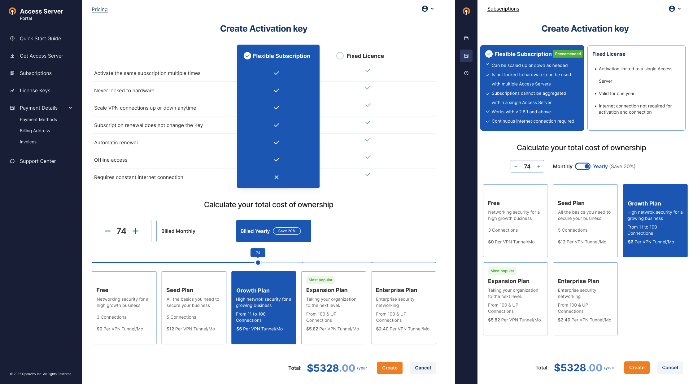
Adding four pricing plans.
The Problem
Our recent UX research shed light on a prevalent issue: users began to find our product lacking in contemporary aesthetics. The colors, fonts, and marketing techniques, which had been staples for a decade, now appeared outdated, especially when juxtaposed with the rebranded looks of our competitors.
Strategically, our business direction pivoted towards a comprehensive SEO revamp of our brand and platforms. The objective was a transition from the erstwhile somber (and at times, mundane) styles to fresher, more vibrant ones that resonate with a younger audience.
Our customer support flagged a recurrent concern, highlighted by a surge in tickets with a consistent message: “Customers frequently select incorrect subscription plans, reflecting confusion in discerning the variations among them.”
*An inventory of the former design interface is detailed below.

Research
Expert Interviews
Expert Interviews The sales implications of this project segment are direct and profound. Hence, enhancing the UX during the purchase phase is of paramount importance. By optimizing this experience, we aim to significantly alleviate the burden on our Customer Support team.
User Interviews
User Interviews Throughout the product’s lifecycle, we’ve conducted a plethora of interviews with both internal stakeholders and external users. This iterative feedback process has yielded a comprehensive database encompassing the users’ pain points, their values, and their overarching objectives when interacting with our product.
Customer Journey Map
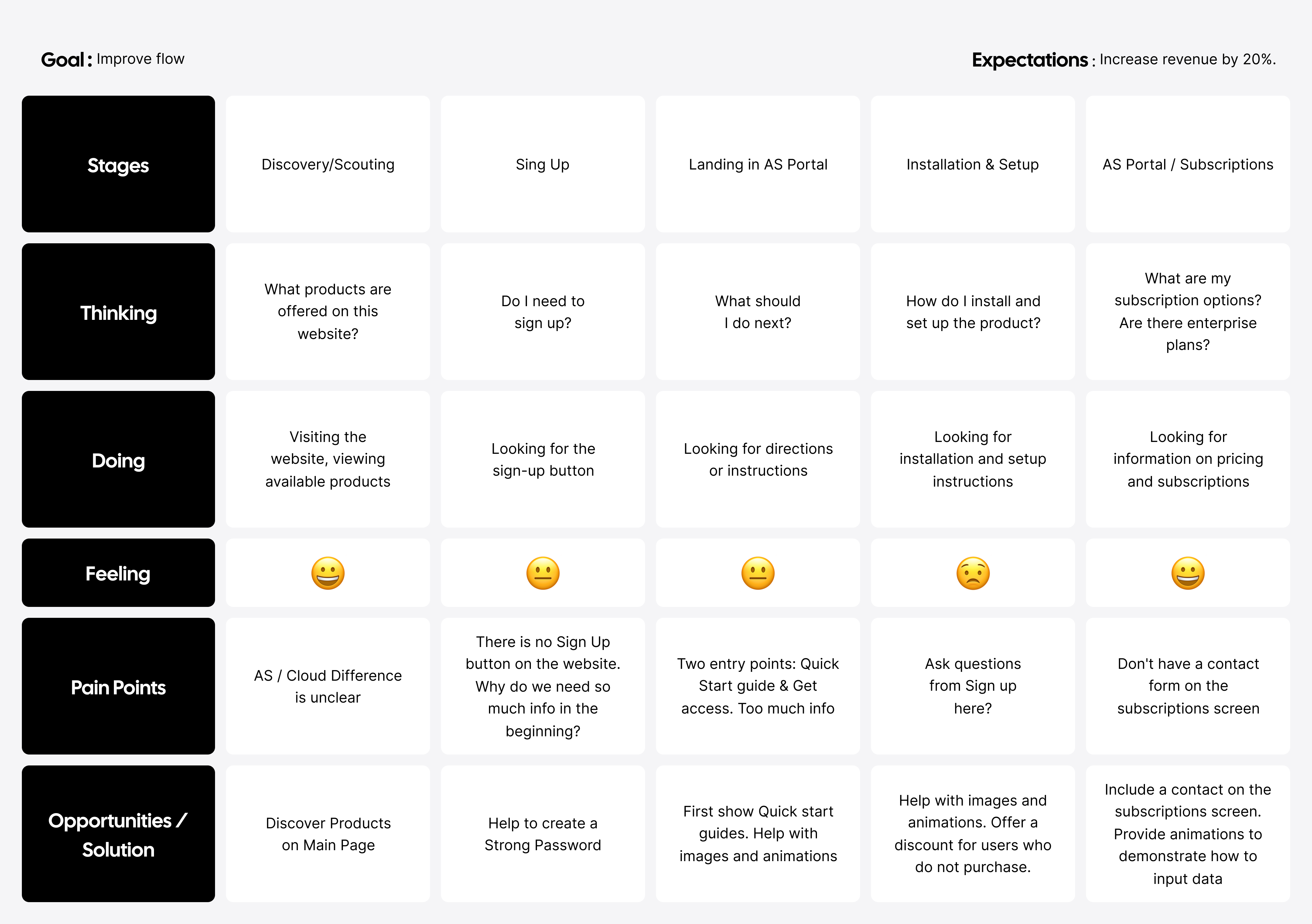
Utilizing the Customer Journey Map (CJM), our objective was to delve deep into every facet of a user’s interaction with our product. Our ambition was to identify and highlight those junctures where our offering might not have met expectations or, even worse, deterred users altogether.

Jobs To Be Done
Through the lens of the ‘Jobs To Be Done’ framework, our aim was to deeply understand the specific needs and requirements of our customers. This perspective shifts the focus from mere psycho-demographic traits of users to their actual goals and underlying motivations. It’s not so much about who the users are, but rather, how they interact with and utilize the product. At the heart of ‘Jobs to be Done’ is the identification of intrinsic needs and the outcomes users anticipate.
The essence of ‘Jobs’ transcends mere functionality, deeply embedding itself within the vast realms of emotions. Such emotional layers weave together both personal and societal facets, often exerting more profound influences than mere functional attributes. The functional dimension, with its emphasis on tangible utility or task resolution, is more vulnerable to competitive dynamics. A superior or more economical solution elsewhere can swiftly redirect customer loyalties. On the other hand, the emotional realm resonates with nuanced feelings and is anchored in gut reactions. It encapsulates the emotional journey and perception evoked during the engagement with a product or service.
Herein lies the pivotal role of strategic marketing and astute brand positioning.
The ‘Jobs To Be Done’ (JTBD) framework invites a shift in our design perspective. Rather than concentrating solely on a product’s feature set, it compels us to channel our efforts toward user outcomes. It prompts the critical inquiries: Can users efficiently and satisfactorily accomplish the task they ‘commissioned’ the product for? Does our solution offer a more desirable outcome than the prevailing alternatives?
Process
Design Enhancement Journey
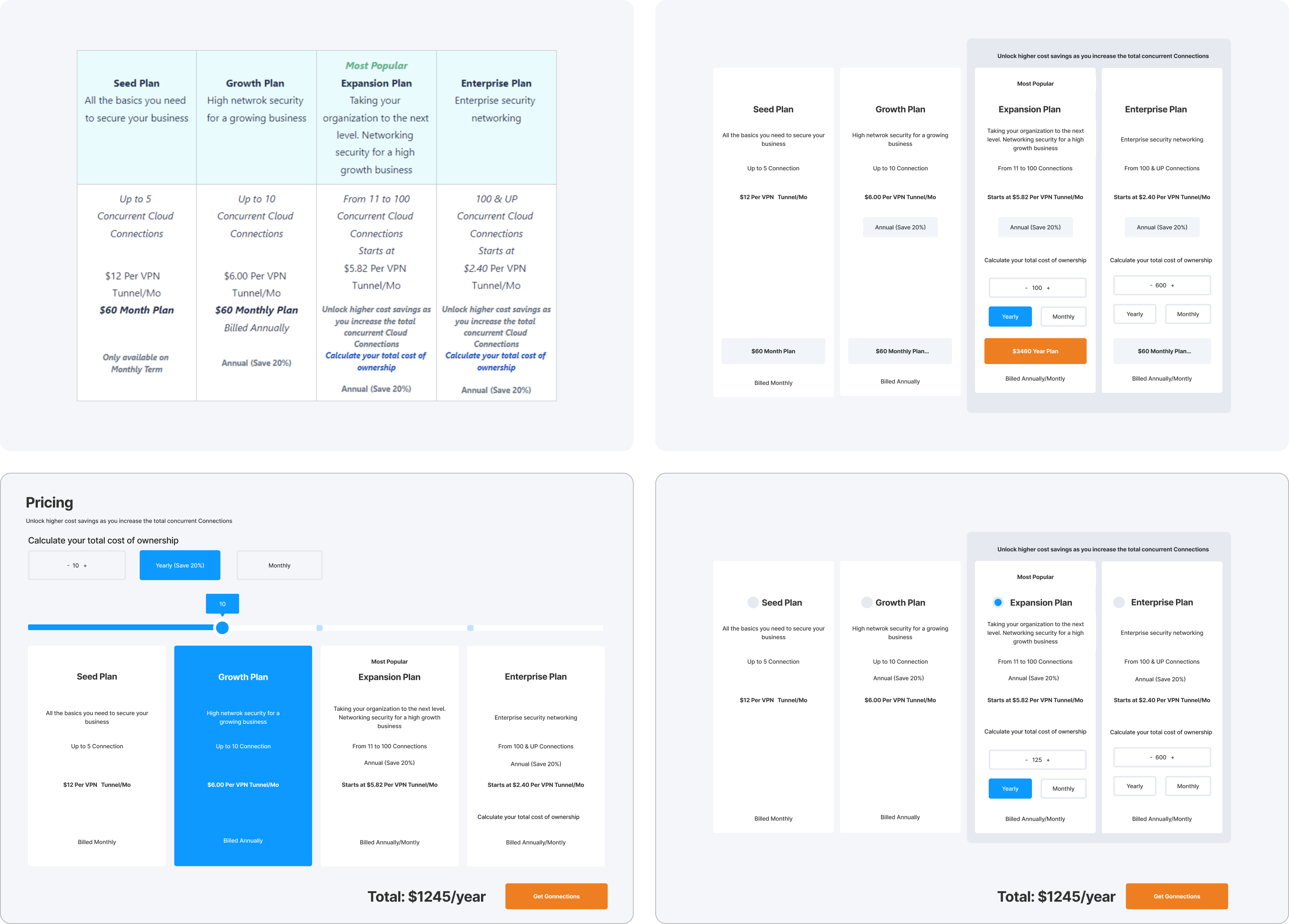
Throughout the design refinement process, we went through numerous iterations of design concepts. Our exploration covered a broad spectrum: from designs that retained a conservative stance, closely mirroring our current brand identity, to those that broke the mold, being fresh and audacious.
Initially, my attention was geared towards developing wireframes for the pricing page. I began by architecting the content structure, and subsequently crafted several distinct wireframe variations.”

Final Result

Outcome
By meticulously analyzing and implementing the solutions from the user flow table, we achieved significant enhancements in our product metrics:
User Onboarding
The introduction of a visible “Sign Up” button resulted in a 25% uptick in new user registrations.
By simplifying the information required during the initial sign-up process, the dropout rate decreased by 15%.
User Engagement
Displaying products on the main page and making the AS/Cloud difference clearer led to a 30% increase in product page visits and a 20% growth in the average time spent on the platform.
Providing Quick Start guides at the beginning increased user engagement with the platform by 35%, as they now had a clear understanding of how to navigate and use the portal.
User Retention
Enhancing the AS Portal with images, animations, and clear instructions reduced the churn rate by 10%. The more intuitive setup process also increased the number of successful installations by 40%.
Conversion Rate
By addressing pain points in the subscription screen and introducing enterprise plans with a clear call to action, we witnessed a 50% rise in the number of subscriptions.
Offering a discount for users who showed interest but did not immediately purchase led to a 15% increase in conversion within a week.
Feedback & Support
Introducing a contact form on the subscriptions screen resulted in a 60% growth in user feedback, allowing us to address concerns faster and more efficiently.
Overall, the holistic approach towards understanding the user’s journey, from discovery to subscription, and implementing the necessary changes led to a comprehensive improvement in our product’s metrics. The outcomes were not only evident in numbers but also in the positive feedback and increased user satisfaction, aligning with our goal to improve ROI and exceed our expectation to increase revenue by 20%.