Design System
Tokens
Variables
WCAG 2.1 AA
Cross Functional Collaboration
Web / SaaS
Nov 2021 - Feb 2023
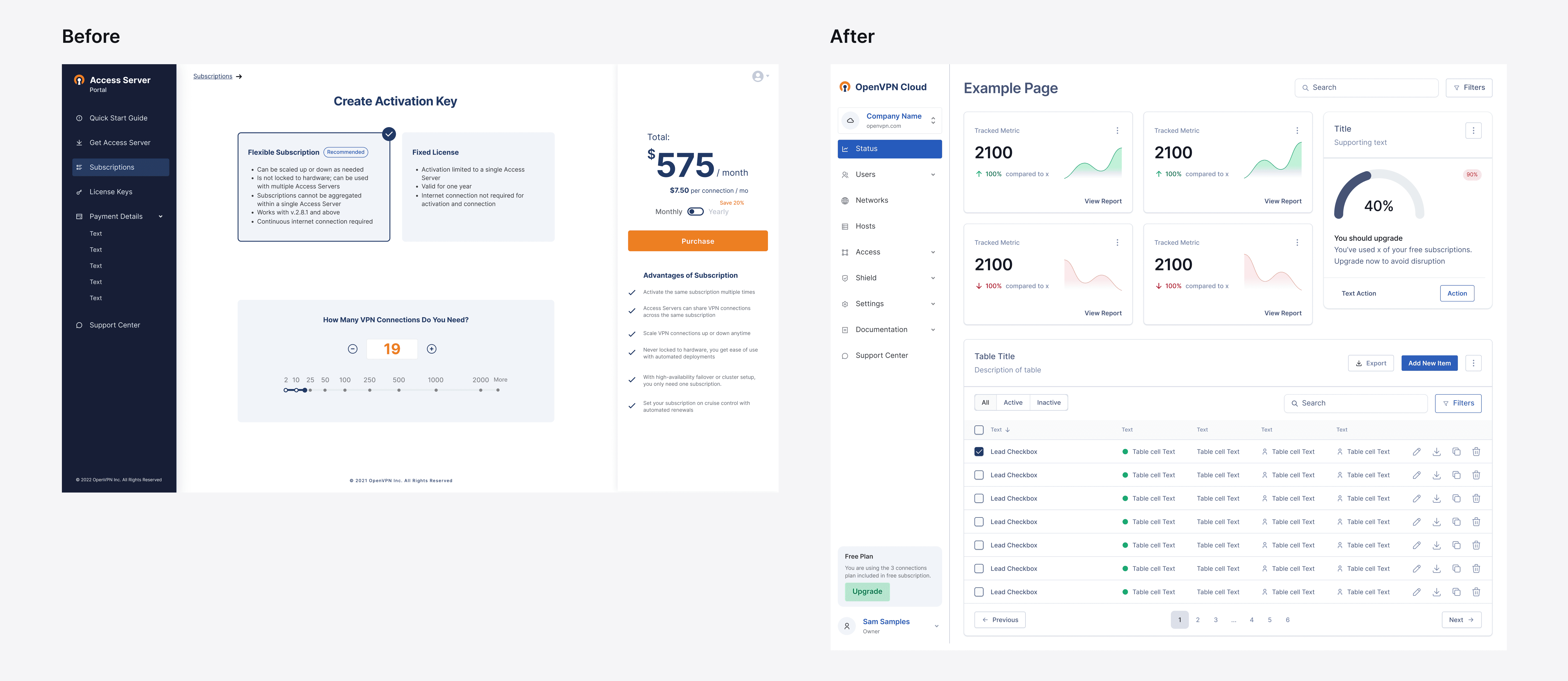
I reduced design-to-code time by 77% — from 45 minutes to 10 — by architecting a design system that unified our cross-functional team of designers, developers, and stakeholders across 14+ countries.

We were drowning in inconsistency. Every designer made slightly different decisions. Every developer rewrote the same code. Then I realized: the problem wasn't the team — it was the system. By architecting a unified Design System, we not only slashed development time by 77%, but freed everyone to focus on real problems instead of pixel-perfect arguments.
Applied Skills
Workshop Facilitation
Design Thinking
UX Research
User Interviews
User Journey Mapping
User Stories, Wireframing
Rapid Prototyping
Usability Testing and Visual Design
Establishing Priorities
Web Content Accessibility Guidelines
Plaform
Web / SaaS
Role & Timeline
Nov 2021 - Feb 2023
What is OpenVPN?
OpenVPN is a private tunnel on the internet that allows computers or entire networks to connect to each other securely. It can be used to link different locations together or to give remote users a safe way to access their home or work networks.
Web site: https://openvpn.net/
Team: 159 people
Revenue: $5.9M
Countries: USA, Canada, Spain, Sweden, Great Britain, Netherlands, Poland, Ukraine, France, Germany, Switzerland, Brazil, Australia, South Africa, Japan, Malaysia, Livan, India
My Role
As a Product Designer, I played a pivotal role in every stage of product development, from ideating groundbreaking product concepts to refining the tiniest details before release.
Delving deeper, I spearheaded two major initiatives:
Developing a unique Design System. This foundational system ensures consistency and unity in product design across various platforms.
Overhauling the entire product's design.
Achievements
In a transformative redesign of the design/code workflow, we've slashed the creation time from a cumbersome 45 minutes down to a swift 10 minutes. By reimagining the framework within our design system, we've empowered a cadre of designers to consistently produce cohesive and unified designs. This not only frees them to tackle broader design challenges but also drastically mitigates potential error points. The outcome? A product that is the epitome of consistency and streamlined efficiency.
Discovery
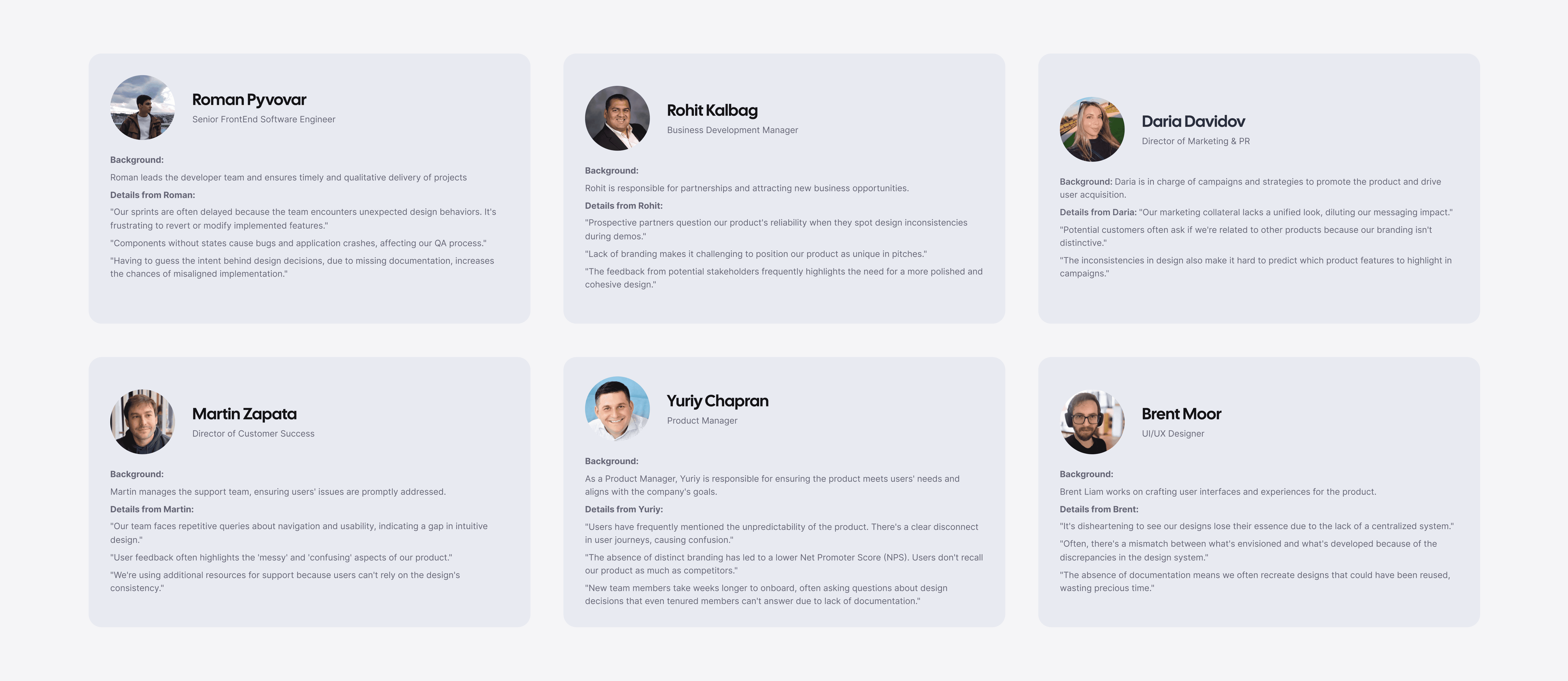
OpenVPN, having evolved from open-source technology, has grown into a massive service utilized by major companies like Tesla and Robinhood. In 2022, we held our annual meeting attended by the entire team, where founder Francis Dinha informed us of the plan to go public in the next three years. To achieve this, we need to improve metrics across all indicators.
Why did the company need a design system?
Inconsistency in products, not just across platforms but also within the product itself.
Weak branding.
Inconsistency in code.
Designers and developers address routine tasks without standardization, significantly increasing the time taken for coding, designing, and frontend testing. This, in turn, reduces the time available for creating new features and evolving the product.
A lack of documentation, leading to extended onboarding times for new employees."
Stakeholder Interviews
Foundation
You can't build a great building on a weak foundation. You must have a solid foundation if you're going to have a strong superstructure.
Gordon B. Hinckley (Quote)
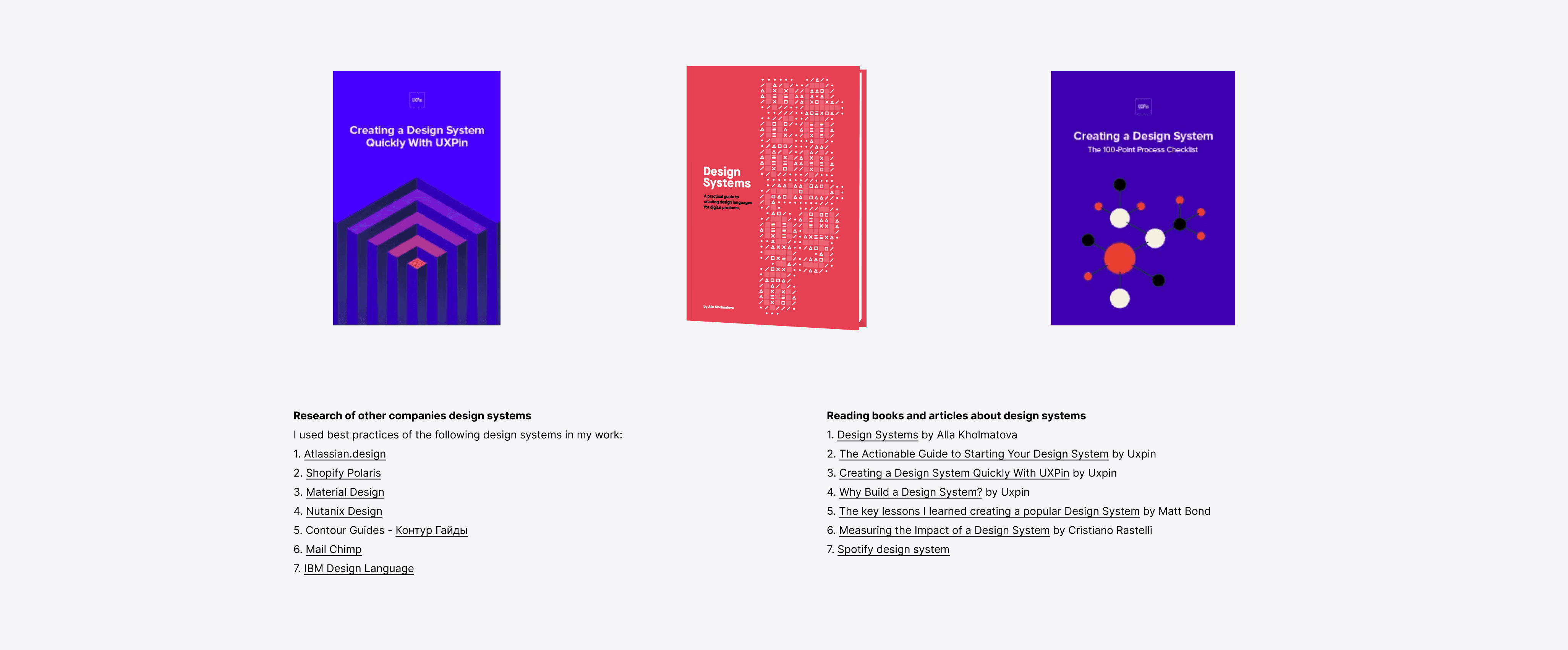
I used best practices of the following design systems in my work
Key Decisions
Workshop on Design Principles
Our journey to develop a design system began by establishing design principles. These principles act as foundational guidelines that our designers adhere to when crafting a product. They maintain consistency throughout the design team and can even be applied beyond the scope of design alone.
The formulation of these principles was a collaborative endeavor. As such, several workshops were set up. After joint discussions with the entire design team, we distilled the core design principles for our organization.
Research summary:
I cataloged all components currently used in the product, and based on this, I grouped the components, ranging from the simplest to the more complex ones that comprise multiple components. The results are presented in the image below.
Prossess
Four of us. Two-week sprints. Day one: divvy up tasks, estimate hours. Sprint end: show what we built, hand it off to another design team for testing.
Week three: They'd workshop our components with us, tear them apart, tell us what was broken. We'd fix it next sprint.
This feedback loop became crucial in phase two — when we moved from simple stuff (buttons, status badges) to the hard things (tables, inputs, form fields). A table isn't just a table. It needs status badges. Avatars. Search. Sorting. All those pieces had to be designed and validated before we could build the table itself.
The real challenge? Planning. With basic components, you can wing it. With complex ones nested inside each other, you can't. Everything had to happen in the right order, or you'd waste two weeks building something that broke when you added the next piece.
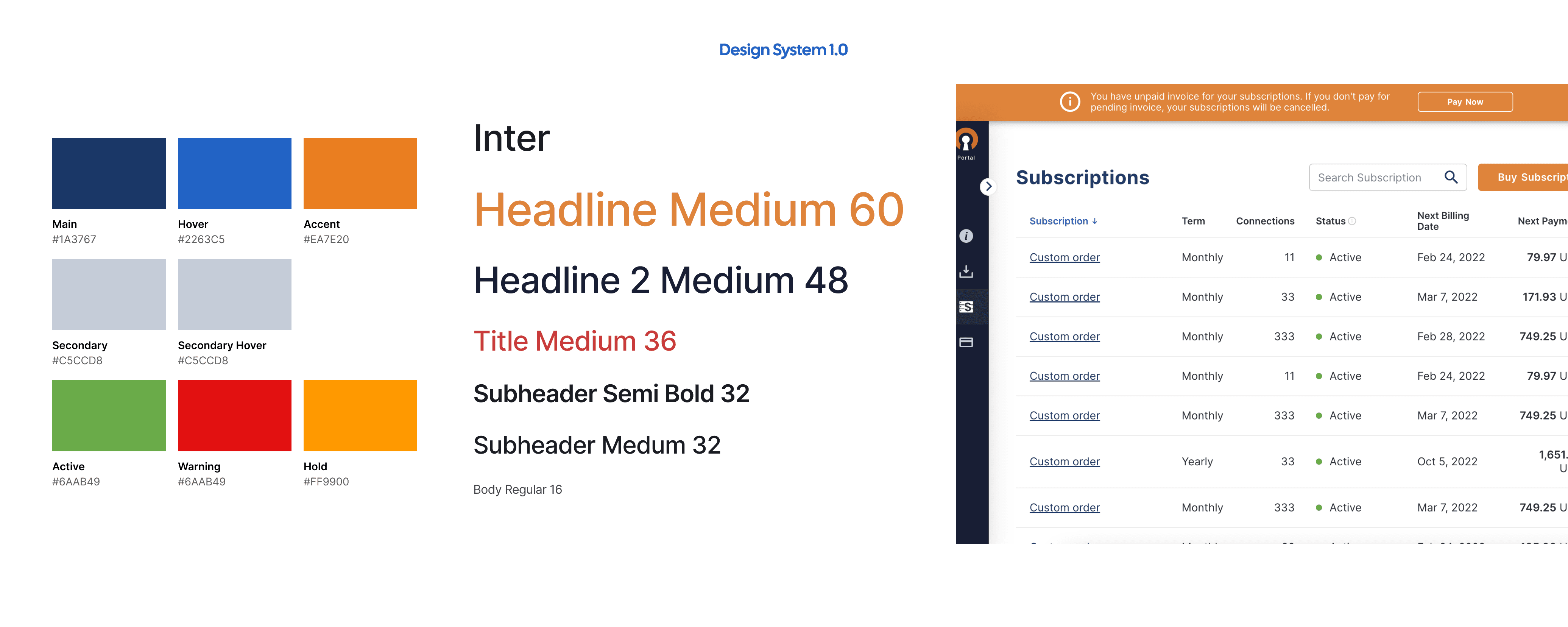
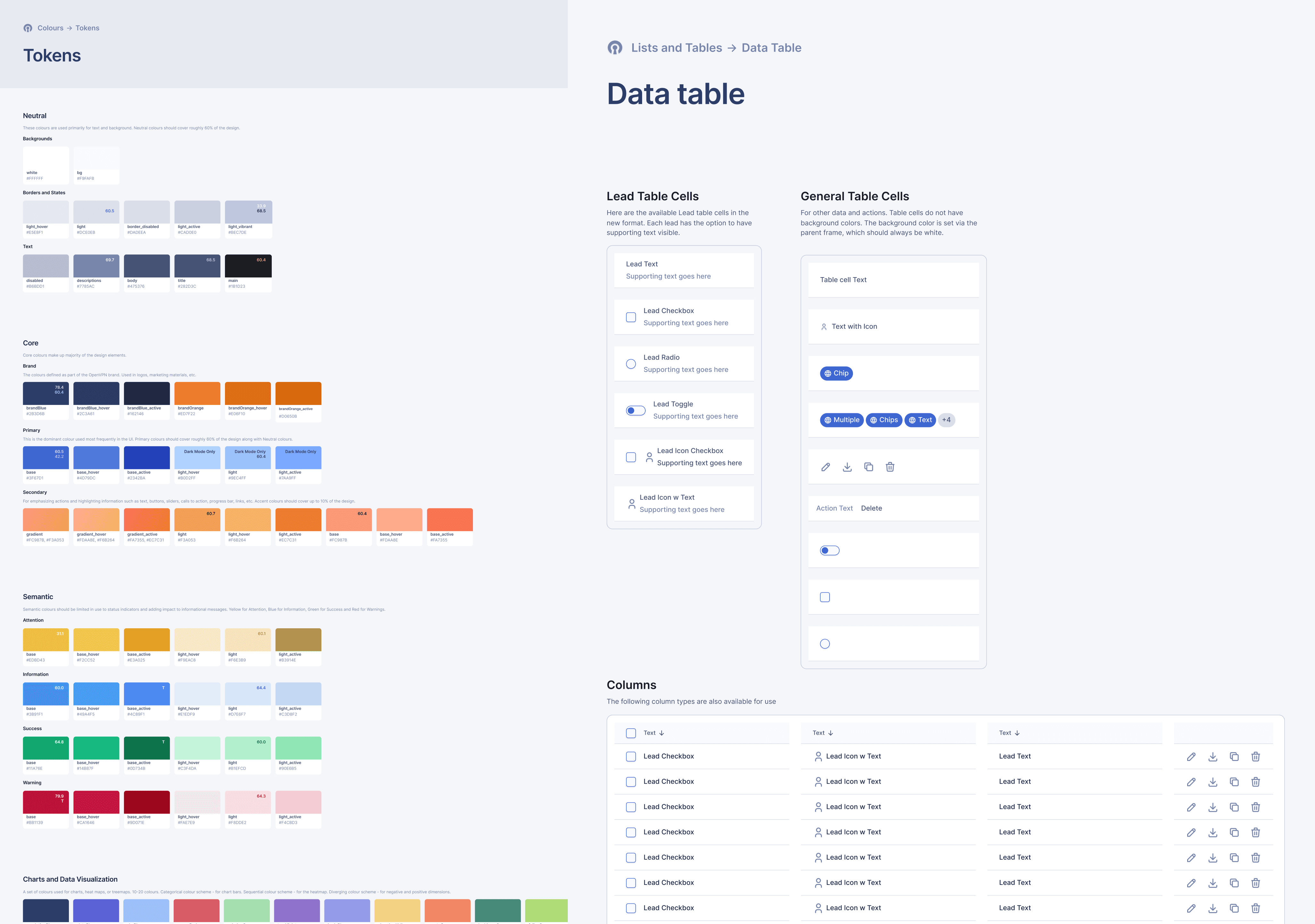
Case in point: Color
Colors seem simple. They're not. We built:
Accessibility guidelines (contrast ratios, WCAG compliance)
Real-world examples (how the color actually looks in context)
Design tokens (so developers knew exactly what we meant)
Outcomes
When I left, the Design System wasn't finished. But the team was already seeing results.
For developers: Building new features became assembling Lego blocks instead of reinventing the wheel. New devs stopped spending weeks figuring out how we worked — they could contribute on day one.
For the codebase: OpenVPN had four separate products. Before, each had its own version of the same button. The Design System killed that duplication. Testing became reliable. Everything worked together.
For designers: They stopped obsessing over "16px or 18px?" and started solving real problems. Consistency was built in. Mistakes became harder to make.